Miyus
This is the official end-user documentation for the Miyus Ghost theme.
- Latest theme version: 1.4.0
- Latest theme demo: Click here
Getting started
Welcome!
This documentation serves as a guide to using the new theme. We'll assume you're familiar with Ghost basics.
✨ New to Ghost?
If you're unfamiliar with Ghost, the official Ghost Help Center offers a wealth of resources and guides to get you started: Ghost Help Center.
Uploading the theme
This section details the process for uploading a theme within the Ghost Admin interface. Uploading allows you to integrate a new theme with your publication and subsequently activate it for use.
Steps
Theme Settings
Customize the theme using the Theme Settings located in the Design & Branding section of your Ghost dashboard.
Brand
This section details how to customize your website's branding through the Ghost theme settings' Brand tab. You can modify elements like the site description, accent color, publication icon, logo, and cover image.
To customize brand options, you need to:
Site description
This is the default setting for the site description. By default, the site description will be displayed as the homepage hero description.
To change the Site description:
💡 Tips
- On Ghost, the site description is being used (unless no custom meta description specified in the Meta data section in the settings) to generate the meta description tag which is really important for SEO.
- If you want to keep the Site description intact but still want to customize the homepage hero description, head over to the Hero section settings.
Accent color
The theme's main color is the accent color, which is typically the color that represents your brand. You should choose an accent color that matches your brand identity and stands out from the rest of the design.
To change the Accent color:
Publication icon
To create the favicon of the website, Ghost uses the publication icon as the source. The favicon is a small image that appears next to the website title in the browser tab. It should have a square shape (1:1 aspect ratio) and reflect the brand identity (as shown in the logo).
To change the Publication icon:
Publication logo
The Publication logo is the image that appears on the top left corner of the header throughout the theme. It represents your brand identity and should match your brand logo.
When you upload the Publication logo, it will replace the Site title that shows on the top left corner of the site header.
To change the Publication logo:
💡 Tips
- A horizontal logo suits this theme best.
- Your logo image should have a minimum height of 32 pixels.
- A transparent background for the logo image is recommended to ensure a consistent and attractive appearance across the theme.
Publication cover
If the Publication cover image is set, it will show up as the background image of the homepage hero section. Otherwise, the homepage hero background will use the secondary background color.
A Publication cover image affects the appearance of the Hero title and Hero description. When you upload a cover image, the text color becomes White, and the image gets a dark overlay. This ensures that the text stands out regardless of the image color.
To change the Publication cover:
Heading font & Body font
Starting from Ghost CMS version 5.104.0, native support for custom typography has been added. With theme version 1.4.0, you can leverage this feature to modify the typography of your website, providing even greater control over your brand's presentation.
To change the Heading font & Body font:
Site wide
This section details how to customize site wide settings through the Ghost theme settings' Site wide tab. You can modify options like the secondary background color, use of tag accent color, and the header behavior.
To customize site wide options, you need to:
Enable dark mode
The theme includes an integrated color scheme switcher, providing you with the flexibility to activate or deactivate the color theme selector for your website as desired.
To enable/disable the dark mode option, you need to:
Note: The theme automatically detects the preferred color scheme from the user's browser settings and switches to the corresponding color theme during their initial visit.
Dark mode logo
Enabling dark mode provides an additional option to upload a logo specifically designed for the dark color scheme.
Important: Ensure you upload a version of your logo that is clearly visible on a dark background, typically one that is light-colored.
To upload a logo for the dark mode, you need to:
Secondary background color
To customize the appearance of your site, you can choose a different background color for the header, footer and hero sections of the home, author, tag, post and page layouts.
💡 Tips
- Try to use a light shade of your brand color to maximize the visibility
You can generate the color shades on this website.
- The secondary background color will be replaced with the tag accent color (where tag accent color is available), if the Use tag accent color option (explained below) is enabled.
- In dark mode, the secondary background color will automatically adjust to a suitable dark shade.
Use tag accent color
If you turn on the Use tag accent color option, the tag color (if it exists) will take the place of the secondary background color. The primary tag's color will be used when there are more than one tags.
Fixed header
When you scroll down the page, the Fixed header option will keep the header in place at the top of the screen.
Contact form endpoint
If you want your readers to contact you directly, you can add a contact page to your website. This theme includes built-in Formspree.io integration for easy setup.
- Please refer to this guide for setting up a fully functional contact page.
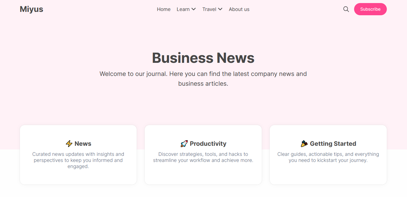
Homepage
This section details how to customize the home page of your website through the Ghost theme settings' Homepage tab. You can enable or disable sections like the Hero and featured links, along with other dynamic elements.
To customize homepage related options, you need to:
Hero Section
The hero section includes a title and a little description at the top of the homepage.
Hero Title
Hero Description
Hero Subscribe Form
You can show/hide the newsletter signup form on the homepage hero section.
This form is only visible to non-members.
💡 Tips
In the absence of custom hero title and description being set, the theme will utilize the following defaults:
- Hero Title: The site title of your publication will be displayed.
- Hero Description: The site description of your publication will be displayed.
Featured Links
Right below the hero section, you have the option to showcase some links to your pages or tags that you want to emphasize with the Featured Links feature.
- Create the pages or tags that you want to link to and obtain their slugs.
- After you have the slugs, you can enter them as a string separated by commas.
- To apply the modifications you've made, click the "Save" button.
Example:
Preview:
💡 Tips
- To have a public tag page, you need to assign at least one post to each tag that you are using. (If a tag has no posts, you will see a 404-error page)
- The Featured Links section will be disabled if the 'Featured links' field is blank.
Editor's Picks
The Editor's Picks section showcases the featured posts on the homepage, below the Featured Links section. This section does not require any configuration.
To display a post on the Editor's Picks section, simply mark it as Featured.
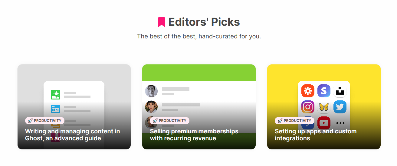
If there are no featured posts, the section will not appear on the homepage.
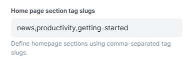
Homepage Sections
Preview:
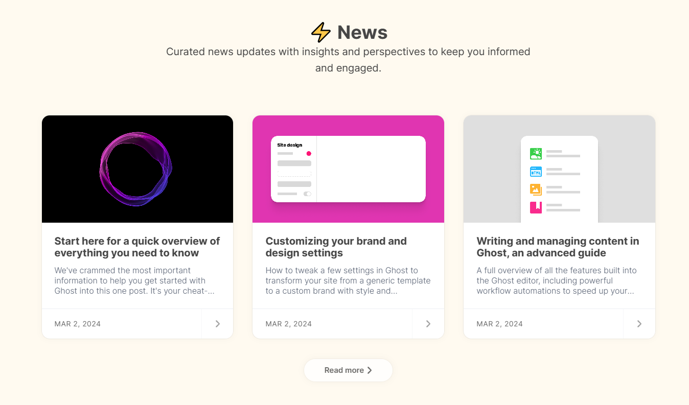
Follow these steps to create a section for a specific tag on your homepage:
- In your Ghost dashboard, go to the Tags section and find the slug of the tag you want to use for the section.
Once you have the tag slug(s):
- In the Ghost Admin, go to the 'Design & branding' settings.
- On the right-hand side of the screen, click on the "Homepage" tab.
- In the field labeled "Home page section tag slugs", type the tag slugs.
- To save your changes, click on the "Save" button.
Example:

💡 Tips
- To change the background color of the tag sections, go to your tag page and set the Tag color option.
- To display the section background with the same color as the tag, you need to activate the Use tag accent color option. You can find this option under Settings -> Design & branding -> Site wide.
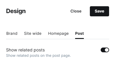
Post
This section details how to customize the post layout of your website through the Ghost theme settings' Post tab. You can enable or disable widgets and customize the related options.
To customize Post related options, you need to:
Show related posts
By default, the related posts widget appears at the end of each post. It shows 3 posts that have the same tags as the current post. You can turn this widget on or off with the "Show related posts" option.
Advanced Options
The theme offers advanced customization options and enables advanced functionalities through other features. Explore all available customization options in this section.
Navigation
Primary Navigation
To customize Primary navigation, you need to:
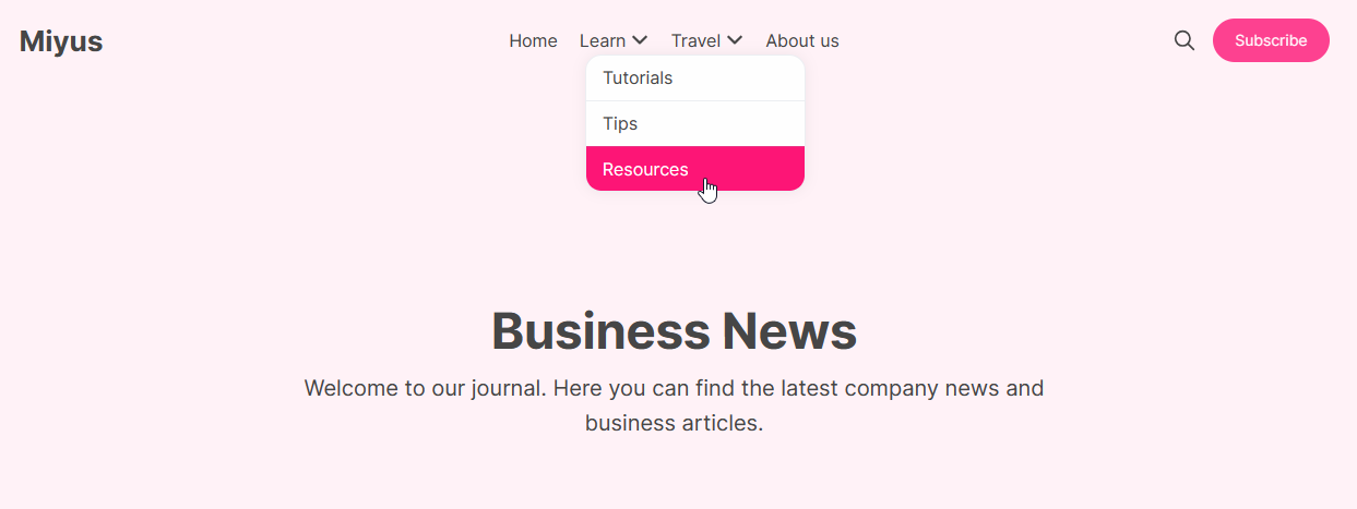
By default, this theme supports a drop-down menu in the header navigation that can display a second level of items.
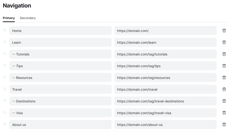
You can easily create a sub-menu under any main menu item in the header navigation of this theme. This feature is built-in and does not require any additional configuration.
Preview:
Secondary Navigation
To customize Primary navigation, you need to:
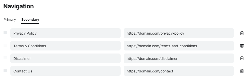
Preview:
Translation
Theme Translation
The theme is fully compatible with the native translation option in Ghost CMS. This means that text in a theme is translated based on the language set in Ghost Admin.
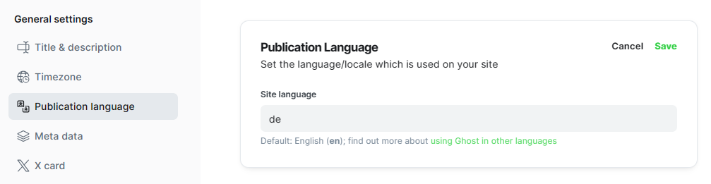
The theme is currently available in following languages:
en- English (Default)de- German
We are happy to offer free translation services for any language that is not listed above.
Please reach out to us if you need our assistance with your language preference.
Portal Translation
Portal is an independent feature that is not part of the theme. However, you can change the language of your membership pages to match your publication.
To turn on Portal translation option:
You can find more information about this option in our comprehensive guide.
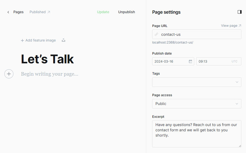
Contact page
If you want your readers to contact you directly, you can add a contact page to your website. This theme includes built-in Formspree.io integration for easy setup.
Add the contact page
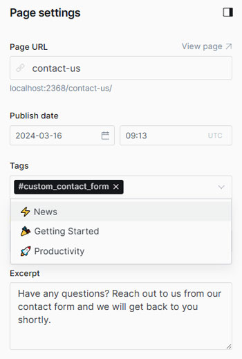
- Create a new page, add a page title, add an excerpt, and open the 'Page settings' panel using the icon in the top right of the screen.
- At the bottom of the panel you’ll see a dropdown menu titled 'Template'.
- Use the dropdown menu to select the 'Contact' template, close the panel.
- Finally, click 'Publish'.
Easy: Standard Contact Form
To simplify setup, we've pre-built a contact form into the contact page, featuring fields for Name, Email Address, and Message. You can enable this quickly and easily, even without any coding knowledge.
Create a form on Formspree.io
- Go to formspree.io and sign up for an account.
- Once signed in, create a new form and obtain the endpoint URL for the form.
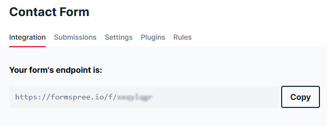
Add your Formspree endpoint
- Navigate to 'Design & branding' settings in the Ghost Admin.
- Locate the "Site wide" tab on the right-hand side of the interface.
- Navigate to the field labeled "Contact form endpoint" and toggle on or off the setting.
- Paste your Formspree endpoint. e.g:
https://formspree.io/f/xeqylqgk - To apply the modifications you've made, click the "Save" button.
Advanced: Custom Contact Form
If you prefer to use a custom contact form instead of the one included with the theme, you can do so without editing the theme files.
Important: This step is not required if you have set up the standard contact form.
Enable the custom contact form
Add the custom contact form
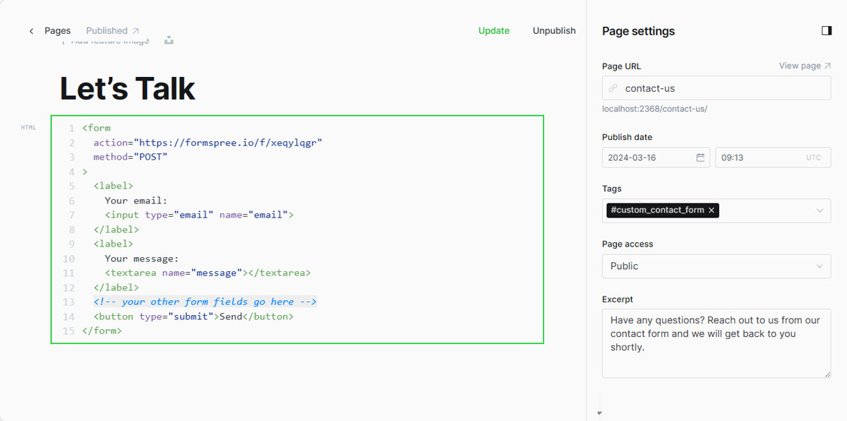
- Go to your Formspree account and copy the form content from the "HTML" section.

- Navigate back to the Ghost dashboard and open the Contact page.
- Create an HTML card and paste the copied HTML code from Formspree.
- Customize the form with your custom fields.
- To apply the modifications you've made, click the "Update" button.
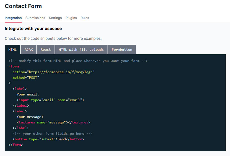
Example Custom Form Code
<form action="https://formspree.io/f/xeqylqgr" method="POST">
  <label>
    Your email:
    <input type="email" name="email">
  </label>
  <label>
    Department:
    <select name="department">
      <option disabled>Select a department</option>
      <option value="Sales">Sales</option>
      <option value="Billing">Billing</option>
      <option value="Customer Support">Customer Support</option>
    </select>
  </label>
  <label>
    Your message:
    <textarea name="message"></textarea>
  </label>
  <button type="submit">Send</button>
</form>
As long as you adhere to the format described above, the form submission will be processed through an AJAX request by default, preventing redirection to formspree.io after submission.
Authors page
The Miyus theme includes a predefined Authors page template, which features a comprehensive list of your blog's authors.
Add the authors page
- Create a new page
- Add a page title
- Feature image (optional)
- Open the 'Page settings' panel using the icon in the top right of the screen.
- Add an excerpt (optional)
- At the bottom of the panel, you’ll see a dropdown menu titled 'Template'.
- Use the dropdown menu to select the 'Authors' template, close the panel.
- Finally, click 'Publish'.
Code injections
The theme facilitates a growing list of customizations via the code injections option of Ghost. Explore all available customization options in this section.
Google fonts
Now you can use native Custom fonts option of Ghost.
The theme offers the flexibility to incorporate Google Fonts or other font libraries. You can choose to set two different fonts for titles and body text or use the same font for both throughout your site.
Obtain the embed code
- Visit fonts.google.com & and choose your preferred font.
- Click the "Get embed code" button to obtain the embed code for the selected font.
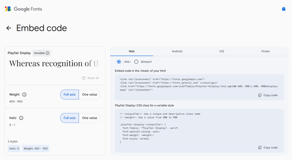
Configure the font with Ghost
To configure the font:
<style>
  :root{
    --body-font:"Font Name Here", sans-serif;
  }
</style>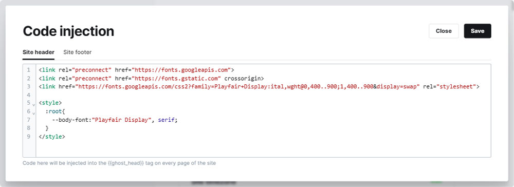
Optional: Set a different Title font
Alternatively, you can specify a distinct font for titles and another for remaining text.
- Select your preferred font on Google fonts.
- Copy and paste the new "Embed code in the <head> of your html" code from Google fonts in to the "Site header" section in Ghost.
Important: When selecting multiple fonts, Google Fonts regenerates the embed code for the header. Ensure that you copy and paste the latest version of the embed code.
- Add the
--title-fontvariable along with your new title font name as follows.
<style>
  :root{
    --body-font:"Font Name Here", sans-serif;
    --title-font: "Font Name Here", serif;
  }
</style>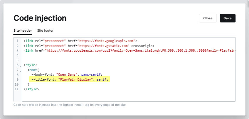
Rounded edges
The theme is designed with rounded edges for most elements by default. However, you can disable or adjust the roundness of these elements using Ghost code injections option.
To disable/modify rounded edges:
<style>
  :root{
    --global-border-radius: 1.5rem;
  }
</style>
Note: To disable rounded edges, use the value 0. e.g. : --global-border-radius: 0;
Maintainance
Follow these essential steps and best practices when updating and maintaining the theme.
Update theme
To keep your site running smoothly and securely, we recommend that you always use the most recent theme version. The latest update includes compatibility with the newest Ghost version, as well as performance enhancements and bug fixes.
Any custom code in your theme will be erased if you update it to the latest versions.
Important: Use the same file name of your current theme to preserve your custom settings.
To update the theme:
- Download the latest version of the theme that is compatible with your Ghost version.
- Navigate to 'Design & branding' settings in the Ghost Admin.
- In the top right corner, identify the "Upload theme" button and click it.
- Upon successful upload, an "Activate" button will be available. Clicking this activates the uploaded theme for your publication.
Changelog
New releases, improvements, fixes and notable changes.
v1.4.0 - February 3, 2025
Files modified
assets/css/vars.css
assets/css/color-scheme.css
assets/css/ghost/comments.css
assets/css/ghost/header.css
assets/css/ghost/page.css
assets/css/ghost/hero.css
package.json
v1.3.2 - June 11, 2024
- 🐛 Resolved color issue with the author card title in the authors page template.
- 🐛 Addressed the page hero title color problem when a cover image is present.
- 🎨 Minor code restructurings & improvements
- 🔥 Removed unused CSS variables
Files modified
assets/built/index.css
custom-authors.hbs
assets/css/ghost/authors.css
assets/css/ghost/hero.css
package.json
v1.3.1 - June 10, 2024
- ✨ A lightbox has been added for the gallery images.
- 💄 Adjusted dark mode colors for an enhanced user experience.
- 💄Modified font sizes for improved readability.
- 💄Restructured mobile menu placement for better navigation.
- 💄Eliminated unnecessary CSS variables to streamline code.
- 💄Implemented additional minor UI optimizations for overall improvement.
Files modified
assets/built/index.css
assets/built/index.js

assets/css/color-scheme.css
assets/css/index.css
assets/css/vars.css
assets/css/components/global.css
assets/css/ghost/content.css
assets/css/ghost/header.css
assets/css/ghost/page.css

assets/js/index.js
+assets/js/lightense.js

package.json
v1.3.0 - June 09, 2024
- ✨ Dark mode option added
- 🔥 Removed unused member views & code segments
- ⚡️ WebP image support added for certain elements
- 🐛 Compatibility issues with older Safari versions fixed
- 💄 Minor UI optimizations
Files modified
assets/built/index.css
assets/built/index.js

+ assets/css/color-scheme.css
assets/css/components/buttons.css
assets/css/components/forms.css
assets/css/components/global.css
assets/css/ghost/author.css
assets/css/ghost/contact.css
assets/css/ghost/content.css
assets/css/ghost/featured.css
assets/css/ghost/footer.css
assets/css/ghost/header.css
assets/css/ghost/hero.css
- assets/css/ghost/members.css
assets/css/ghost/pagination.css
assets/css/ghost/post.css
assets/css/vars.css

assets/js/index.js
+ assets/js/color-scheme.js

partials/author-card.hbs
partials/header.hbs
partials/hero.hbs
+ partials/icons/theme-toggle.hbs
- members/account.hbs
- members/signin.hbs
- members/signup.hbs
default.hbs
post.hbs

package.json
v1.2.1 - June 03, 2024
Files modified
assets/built/index.css
assets/built/index.css.map
assets/css/ghost/authors.css
package.json
v1.2.0 - June 03, 2024
Files modified
assets/built/index.css
assets/built/index.css.map
assets/css/ghost/authors.css
assets/css/components/global.css
assets/css/ghost/hero.css
assets/css/index.css
assets/css/ghost/post.css
partials/author-card.hbs
partials/icons/avatar.hbs
partials/icons/location.hbs
package.json